While
most people use the word "color" to describe visual appearances
or differences in the reflective qualities of objects they see,
many factors are involved in the actual experience of viewing colors.
We often aren't aware of the reasons we respond or fail to respond
to colors.
For
the majority of us who can see an average range of colors, we normally
see colors in terms of hue, saturation, and value
(HSV).
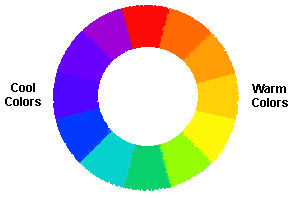 Hue
correlates with the color's position on the visual spectrum, and
is associated with a color's warmth or coolness.
Most people think of red to orange to yellow colors as "warm"
colors. In studies, subjects surrounded by red colors have experienced
increases in body temperatures, heartbeat, and blood pressure. Yellow
is thought to produce higher mental activity levels with less stress
than red. In contrast, deep violet, blue, and green colors typically
produce a sensation of peacefulness, relaxation, or calmness in
test subjects. Some colors are on the borderline; a red/violet or
a yellow/green color can take on different temperatures depending
on its surroundings or the pigments used to mix it. Hue
correlates with the color's position on the visual spectrum, and
is associated with a color's warmth or coolness.
Most people think of red to orange to yellow colors as "warm"
colors. In studies, subjects surrounded by red colors have experienced
increases in body temperatures, heartbeat, and blood pressure. Yellow
is thought to produce higher mental activity levels with less stress
than red. In contrast, deep violet, blue, and green colors typically
produce a sensation of peacefulness, relaxation, or calmness in
test subjects. Some colors are on the borderline; a red/violet or
a yellow/green color can take on different temperatures depending
on its surroundings or the pigments used to mix it.
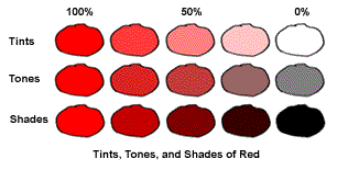 Saturation
(sometimes called chroma) refers to the intensity of a hue. While
a hue in its unadulterated state is a pure color, with a saturation
of 100%, if it is mixed with black and/or white, or another color,
its saturation or intensity as the original color is diminished.
Mixing a hue with black produces a shade; mixing it with white results
in a tint, and a mix with a gray of a similar value produces a tone
of the original hue. Saturation
(sometimes called chroma) refers to the intensity of a hue. While
a hue in its unadulterated state is a pure color, with a saturation
of 100%, if it is mixed with black and/or white, or another color,
its saturation or intensity as the original color is diminished.
Mixing a hue with black produces a shade; mixing it with white results
in a tint, and a mix with a gray of a similar value produces a tone
of the original hue.
Mixing
a hue with its opposite on a color wheel will diminish its intensity.
Imagine mixing a large amount of red paint with a small amount of
its opposite color green paint; the resulting color will be a less
intense and darker red. Continuing to add green to the red will
result in a darker and browner color. If the same red is mixed with
white pigment, a pink color or tint will result. If the same red
is mixed with black pigment, a darker maroon red or shade will result.
In all these examples, the saturation of the original red color
has been diminished.
The
value (sometimes called brightness or lightness/darkness)
of a color is defined by how much total light it either absorbs
or reflects back, regardless of its color or hue. Every color or
variation on a color has a specific value, based on the total amount
of light it reflects.
Value
is not specifically a color issue. Extremely effective designs can
be created with black, white, and gray scale tones using no color
at all. Often our initial reactions to a design are based on how
we unconsciously perceive the value key, or light and dark composition
of the design. We often experience reactions to values in a design,
even a very colorful one, without realizing that the color changes
in the design are also creating a mood based on its equivalent value
key. Gray scale value considerations and value keys will be discussed
in detail in a future module.
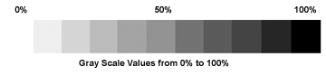
Value
scales for the printing process range from 0% absorption of light
(white) meaning that 100% of the light is reflected back, to 100%
of absorption (black), or no light reflected back. A 50% value is
a middle gray value on the scale, meaning that roughly 50% of the
light is absorbed and 50% is reflected.
|